Terminal
Real-time dashboards with infinite drill-down capabilities. Every interaction, every touchpoint, every conversion tracked and visualized with institutional-grade precision. From 30,000-foot pipeline overviews to granular activity tracking—click any metric to expose the underlying data streams, attribution models, and performance indicators.

Year
2026
Duration
3 Months
Type
Web App
Industry
Saas
Scope
UI UX Design
Prototype
Challenge
One of the main challenges was transforming a complex spreadsheet workflow into an intuitive web application while maintaining the depth of data and functionality. The system had to support eight different user roles—including client view, C-suite view, content managers, and NOC—each with unique needs and permissions, making it critical to design a flexible and role-aware interface. Another challenge for C-Suite role was presenting detailed data for XDR in a way that was both comprehensive and accessible. We implemented expandable tables that allow users to drill down into rows to see deep data without overwhelming the interface, balancing clarity, usability, and functionality across all user roles.
Solution
The project successfully delivered an intuitive, data-driven web application that replaced the previous spreadsheet workflow. The solution supports eight distinct user roles, each with tailored access and views, including client, C-suite, content managers, and NOC teams, ensuring that every user can interact with the platform efficiently.


The design process began by mapping the existing spreadsheet workflow and identifying pain points. Low-fidelity wireframes and user flows helped visualize a more intuitive, data-driven web application. Through multiple rounds of prototyping and testing with stakeholders and internal team, features were refined step by step, focusing on dashboards, data visualization, and modular workflows to ensure a seamless, actionable experience for both novice and advanced users.

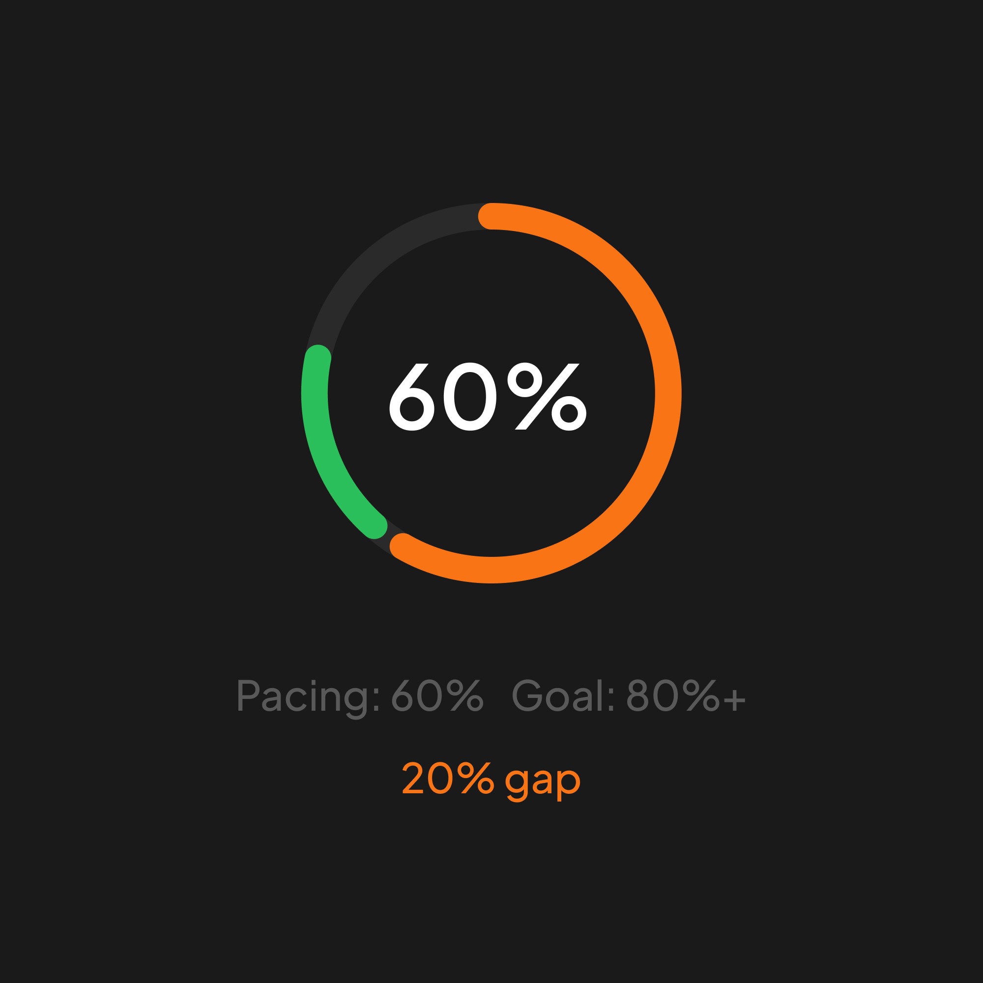
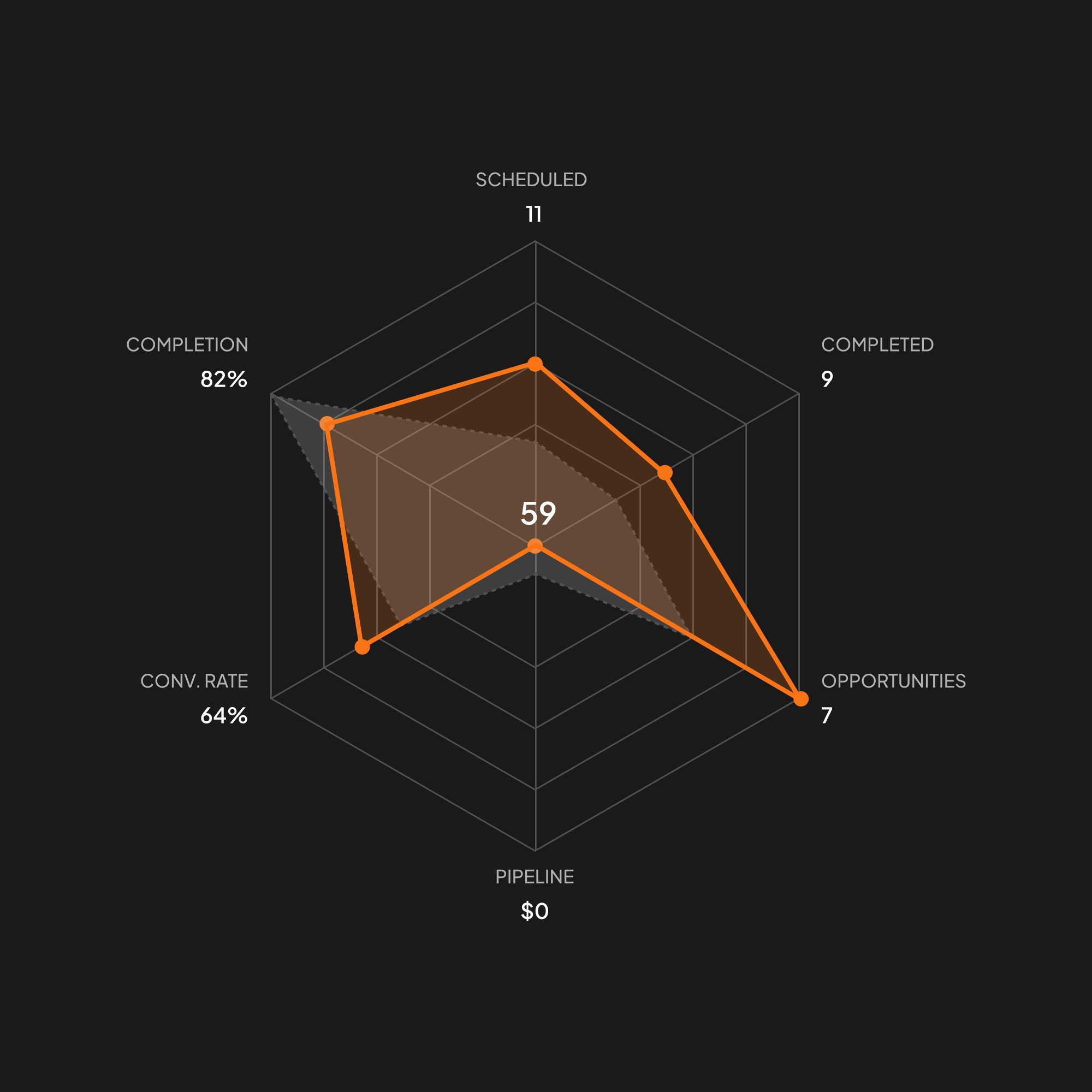
During the project, I designed a wide range of components, from AI indicators to graphs, charts, and status elements. Given the data-heavy nature of the platform, these components played a crucial role in helping users quickly understand and navigate the information presented at each stage.